Mobile Game User Interface design Best Practices
September 2016, 19
In the modern world of mobile gaming vast diversity of portable devices compels mobile games design to cope with all that wide plethora of platforms with different screen resolutions, screen ratios and graphic cards.
Here’s an example of how we’ve coped with those in or Poker project. There are several stages any project has to pass during its lifetime, these are our today’s topic:
-
Single-/multi- platform choice and issues.
-
Competition study.
-
Evolution.
Our Poker app
Overcoming some cross-platform difficulties.
First we had chosen a cross-platform way. Unity had become our weapon of choice.
The most broad game interface design problem is the difference in aspect ratio. iPad devices (including Retina ones) have an aspect ratio of 4:3, while Android devices tend to have wider 16:10 and 16:9 screens. We have a standard method for this obstacle in our “how to design a mobile game” collection of guidelines. All the main elements of the game ui are placed in a 4:3 zone in the screen center. Then “spacers” are added on both sides for wider screens of Android devices.
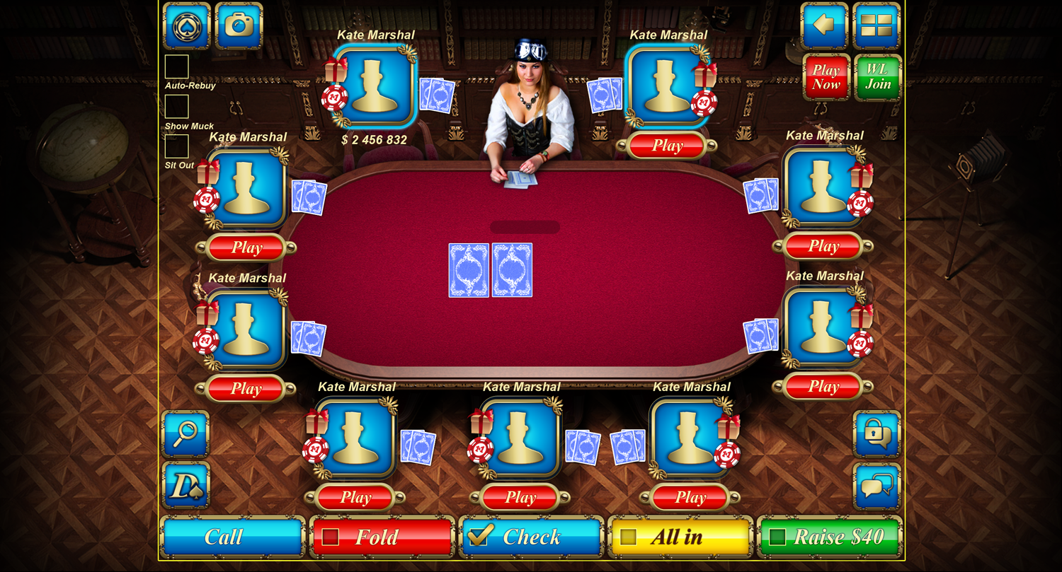
Yellow frame shows iPad view, additional spacers would appear on wider screens.
A nice tip about those “spacers” - they shouldn't be just black frames or likes, try to make them look natural, а part of interior maybe, it helps not to break immersion.
A nice tip about those “spacers” - they shouldn't be just black frames or likes, try to make them look natural, а part of interior maybe, it helps not to break immersion.
Another problem is different texture compression for different Android devices. What it means - that we cannot use universal graphics for all the devices. Some might appear incapable of processing HD graphics, and there isn’t much sense in implementing HD on low resolution devices. Even worse - tests have shown some of the mobile game gui elements suffer a lot of resizing. Both shrinking and stretching damage curves and circular elements and worsen picture quality.
We have developed a system to help to overcome this trouble, during the first app start it defines the type of the device weather it is a tablet or a phone and its characteristics - screen resolution and ratio, devices processing capabilities. Then it downloads graphic assets corresponding to the defined platform type.
Monitoring competition.
A rather important part of mobile game ui design is a research of rival products, studying solutions of other developers.
Sure thing we made one. Our interest was in various solutions in mobile game gui concerning sending gifts to other users behind the table, notifications and many others. A special point of interest was one of the most complicated and important parts of mobile game gui - the game chat. Weather it is an iPhone or an Android smartphone - game chat is a rather fine construct. It parts are tiny and of equal importance, so some cannot be sacrificed in the sake of other’s size. We also were interested in an universal solution for both phones and tablets.
Evolving.
We would like to tell about an important part of games’ lifecycle - evolving and upgrading. Not only stability is the goal, but also user friendliness of the mobile game interface. Both android game design and ios game design have their rules and customs, both Apple and Google have released documents - guidelines on “how to design a game app”.
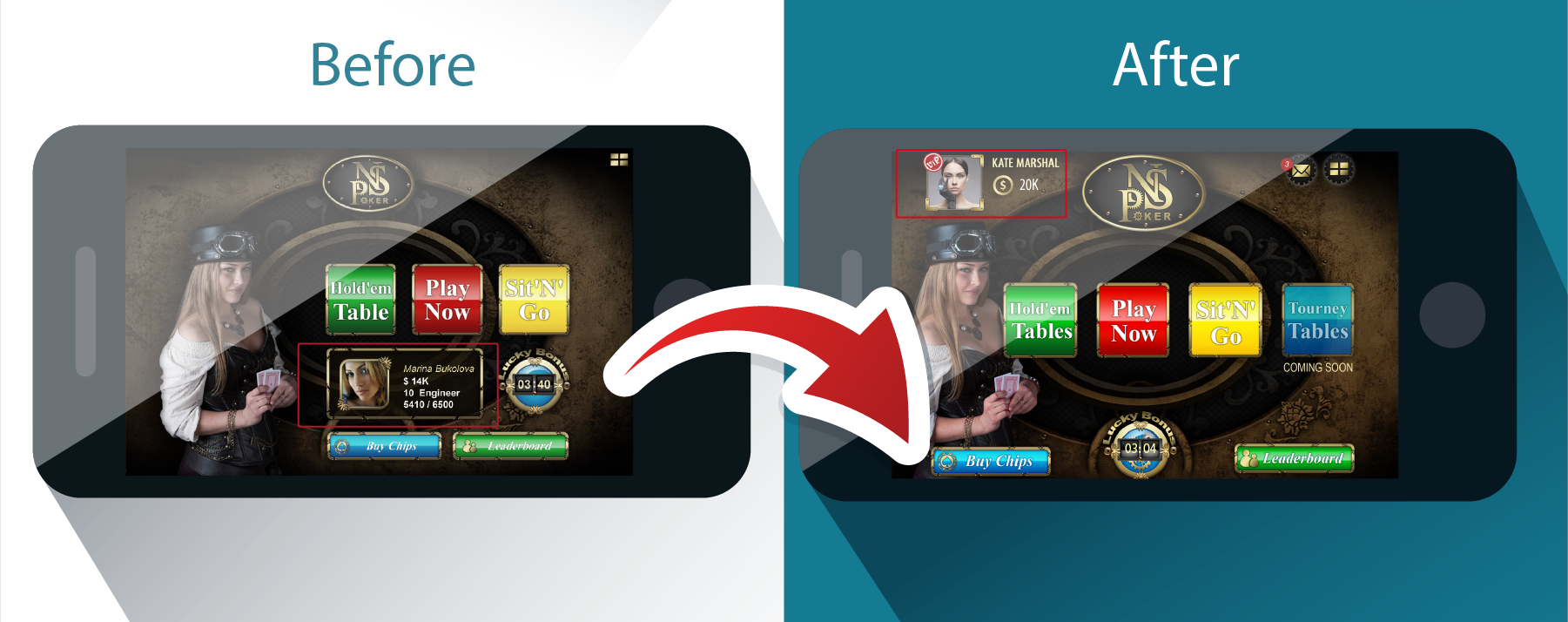
Landing screen:
-
Call to action buttons size was increased, some space was also freed for some new functionality - tournaments.
-
The new placement of ‘’Buy Chips” and “Leaderboard” buttons allowed to enlarge clickable zone. Users miss “Buy” button rarely now.
-
User information field was cut out, that allowed to create a lighter game interface. Full information is now available via userprofile (just a click upon a userpic)
Leaderboard:
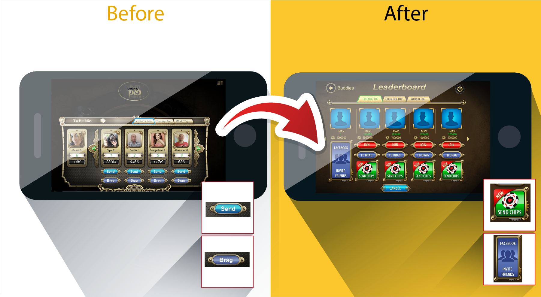
The old version design was overloaded with detail - frames, curls, tiny buttons. We have found out that ui design for games requires some kind of a lighter approach - larger buttons, bigger friends’ photos, a more attractive and vivid “Invite” button.
User profile:
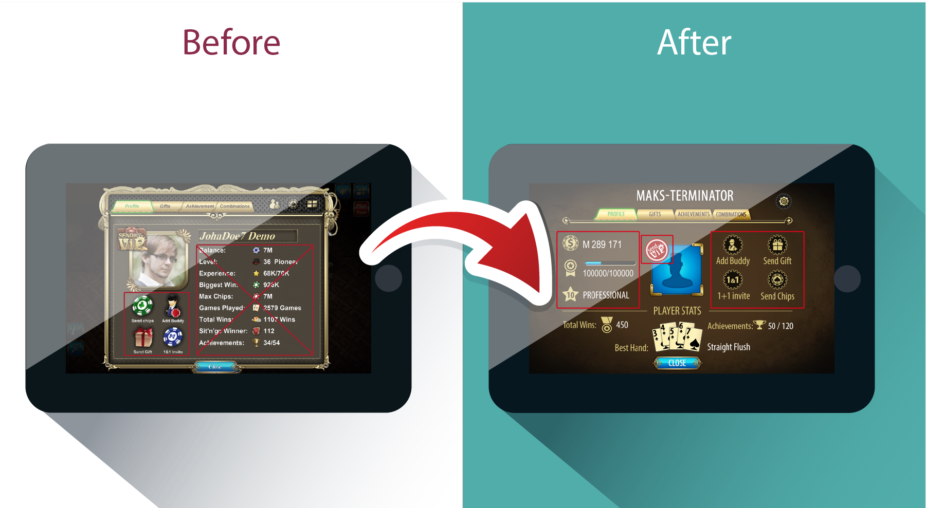
-
We’ve enlightened the design by removing the pop-up frame and changing buttons’ appearance.
-
Mobile game menu design was also altered - buttons “addbuddy”, “sendgift”, “1x1” and “sendchips” were moved towards the right-hand control area.
-
Added some clarity to statistics (some of the text was cut out on the way). Fonts were enlarged.
Poker lobby:
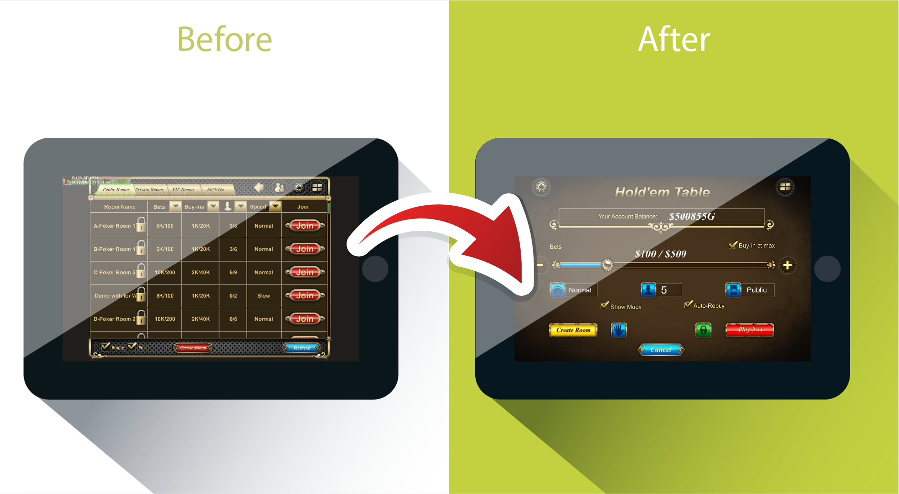
Table type choice slider replaced an inconvenient (for both phones and tablets) table type grid. It allows to chose the number of players, public or private game type, minbuy-in, etc.
Poker Table:
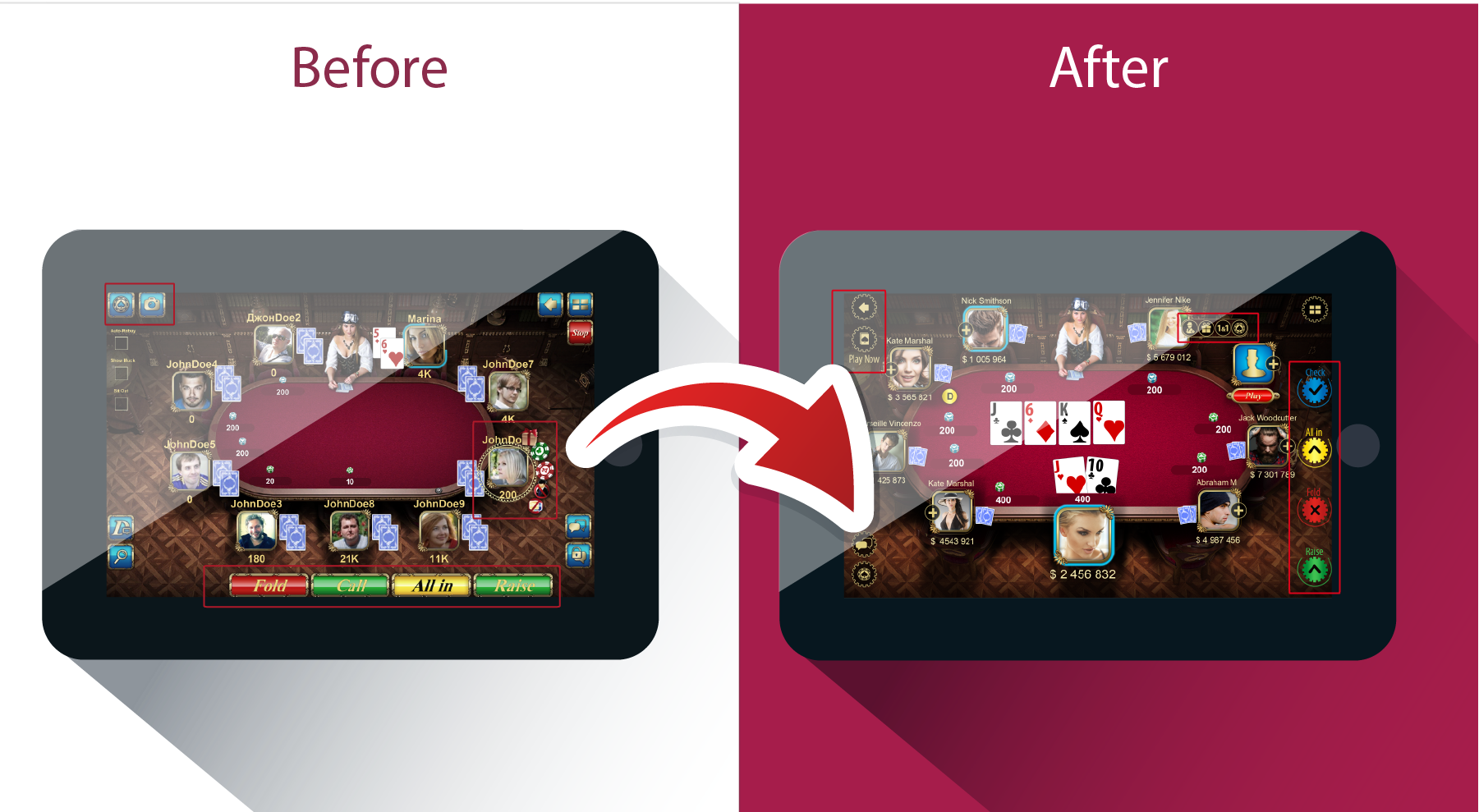
We’ve considered the latest trends in mobile game menu design and:
-
Increased the table
-
Placed the user into the middle of the table (that’s his constant position now)
-
Enlarged user’s photo
-
Moved all the game buttons (ui in games still requires them) to the right and shaped them for users’ right thumbs
-
Reshaped buttons of the user menu (“addbuddy”, “sendgift”, “sendchips”, “1x1”) - now they open after a click on a “+” sign. Their shape and placement are more convenient now.
This is some of our experience in designing and upgrading a mobile game app in sake of improving the UX. Though it might not be a tutorial or a template, it could play as an inspiration. Development of mobile games is an interesting and rewarding activity, certainly worth trying and a good application for any creative mind.